CASE STUDY
Branding for an AI that reasons like an expert
Sagora is building AI for AI systems: an expert force multiplier for organizations running serious AI workloads, reasoning like a world-class engineer to improve the training pipelines, inference stacks, and infrastructure modern AI depends on. The team came to us needing a name to put in front of their work, one that captured who they are and could grow with them over time.



The Insight
Through interviews, we found a company living on two levels — a research lab at its soul, authoritative and credible, fluent with researchers whose trust it already had; and an operator-facing product, approachable and bold, where buyers form their first impression. One name needed to carry both levels, making the company distinctive and memorable to buyers instead of re-proving itself to researchers who were already convinced.
The name they came in with had stopped working. Sagora replaced it with sage, expertise that doesn't need to announce itself, fused with agora, the open square where ideas were tested in public and only what held up survived. Where competitors reach for hard consonants and clipped syllables, “Sagora” carries warmth, combining expertise with human judgement.
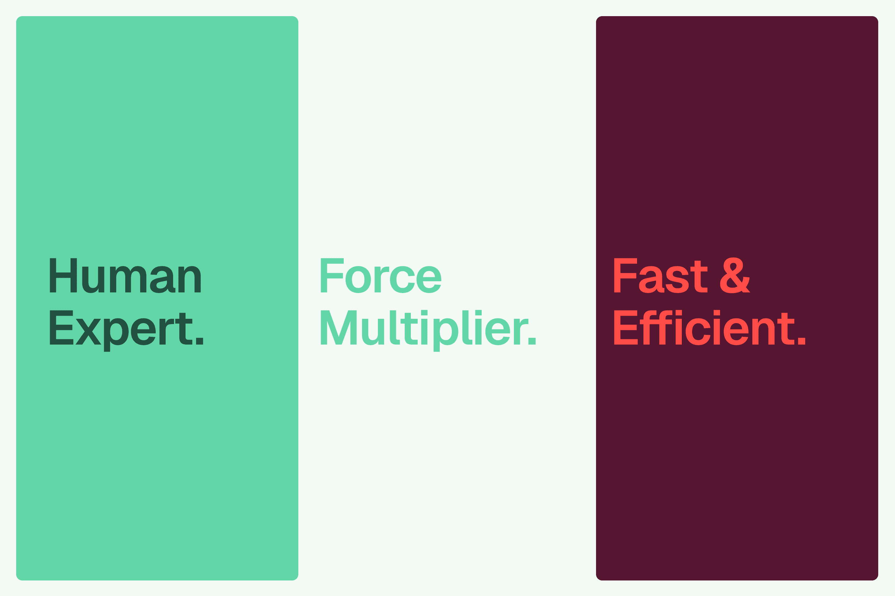
Three attributes bring that positioning into the market: Expert, reasoning with judgement and taste rather than brute force; Force Multiplier, hypothesizing, testing, and measuring to surface what's actually true; and Fast & Efficient, finding the answer without waste, at order-of-magnitude gains in speed and cost. Together they read as methodical, proven, effortless — rigor that earns belief, authoritative yet approachable, a challenger rather than an incumbent.

The approach
We started designing the brand by defining a visual territory. One direction stayed close to the instruments of the lab itself — its glass, its light, the physics of the work. The other stepped back to the human side of it: the expert's hand at the bench, judgment made visible. The former won the room, sharper and more particular to a research lab than any generic "human-centered" brand could claim.
From there, we explored a range of marks. Some felt like precision instruments, grids, hard edges, apertures of light. Others felt fluid: two forms in exchange, resolving into each other. This second read was the one the room kept returning to — forward motion, two states becoming one — founders saw it as a racecourse, as magnets coming together, as a question turning into its answer.
The wordmark had to match that fluidity, and Bricolage Grotesque gets us there: its natural double-story g already carried the human curve we needed, putting a hand into a mark that would otherwise read as pure mechanism. The symbol carries speed. The wordmark's g carries judgment. Together, they imbue the brand's thesis.


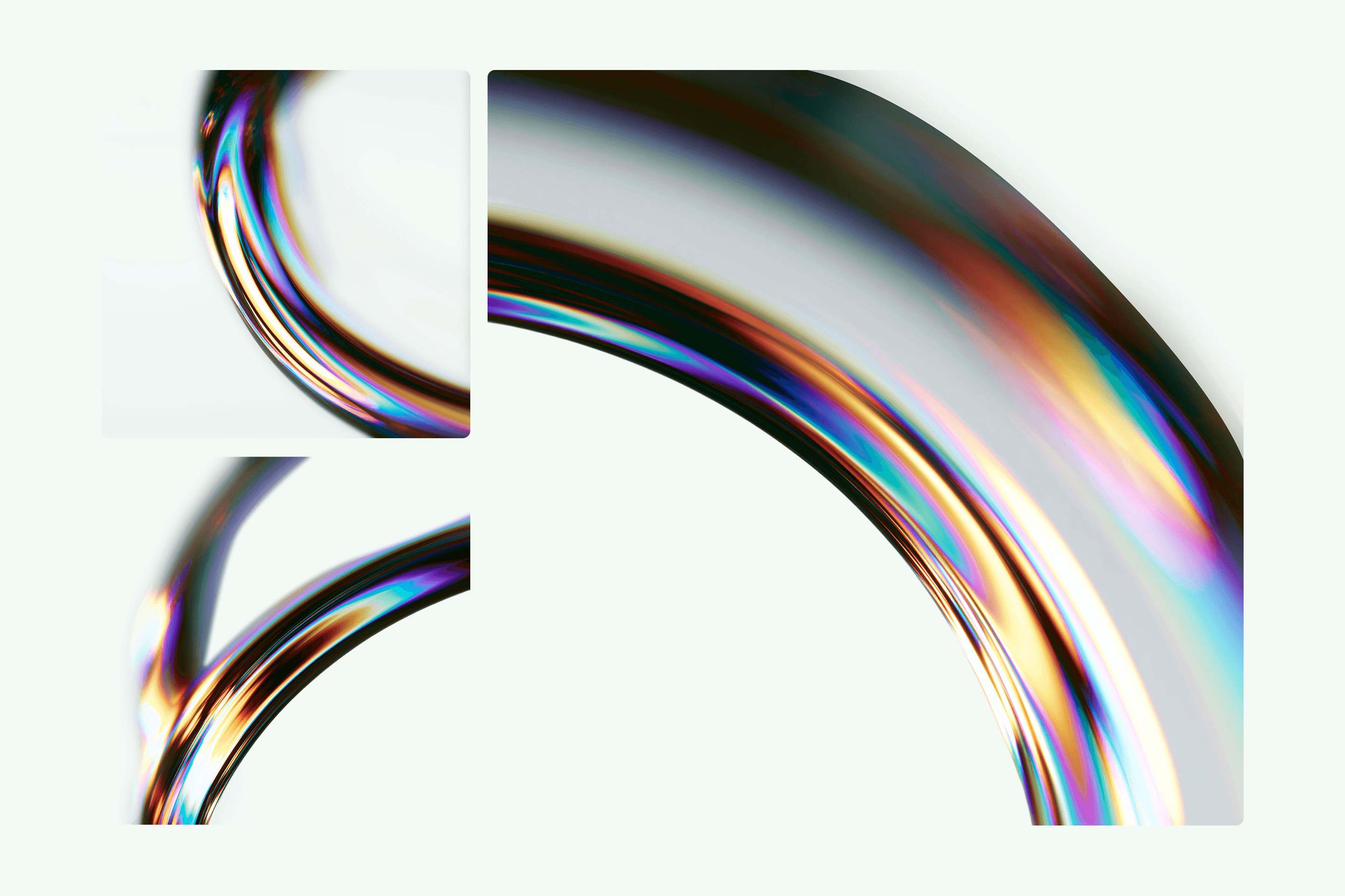
Color, type, and motif carry the same tension. Sage and Pine, grounded by Forest, hold the expertise; Coral marks the payoff at breakthrough moments, with Velvet as its counterpart. Geist runs the type system, precise without going cold. The motif stays inside the physics of light, a beam bending to reveal what it's made of, accelerated and warmed into a fast diagonal, built as a generative system: consistent enough to recognize and different every time.



The Outcome
In roughly four weeks of active collaboration, the company left the sprint with a complete, launch-ready brand foundation: the Sagora name, a full logo system with a custom wordmark, color and type systems, and a starter brand guide.


View more work